OUGD406 DESIGN PRACTICE- Equipment

Following up my idea of illustrating the essential tools of graphic design and placing them on the cover of a book I decided to illustrate everything I could get my hands on in my pencil case and around uni. The sketches again are really poor quality as I didn't see the point in meticulously drawing each one perfectly when i'm simply going to digitalise them.


This is just a play around with how I could potentially layout the front cover of my book, it's just simply organised into a grid like format.


Below are all my digitalised illustrations of my equipment, the aesthetics haven't really been influenced by anything it's just how I found it easiest to illustrate equipment. I have used a variation of line weights to illustrate detail on some of the equipment. They're so clean and simple, I feel by adding anymore detail or colour to them could completely ruin them and detract from the simplicity of my designs. The simplicity is key because it means the viewer can understand the illustrations with ease as opposed to trying to figure out what each one is.


Again I have experimented with the layout of the images into a grid, I purposely sized the images to fit into a grid format, for example the width of the wacom table is the same height as the mac. I have done this so that it is all uniform and looks a lot neater.

From the gridded illustrations I have transferred them over to a book cover so that I can envisage what the final covers will look like.


And then this is the covers with the proposed belly band around it, the belly band works perfectly because it breaks up the images and adds that extra level to what is a simple design. The colours won't be the same, it's just a visual representation of what it could look like.


OUGD406 DESIGN PRACTICE- crests

Below is the development of my LCA crest for the cover of one of my books from design sheets through to digitalisation of the designs


Above is just a variation of design sheets that have been influenced by my research into crests and coats of arms. They're really rough sketches more like doodles but I have a few favourites that hold the text well with out being too much or too boring, these few have been taken further and digitalised so that I can develop them further and decide on a final crest.


The 2 above are based on similar concepts just executed differently, both I think hold their ground and visually represent the course. But I feel they're just too simple and quite boring, I think I can develop these further by adding or removing parts, vastly improving the overall design and actually look more aesthetically pleasing. I don't think the diamond text works well in the circle as it's just too many shapes and it just seems too much visually, with the bottom one I feel the computer detracts from the design as I feel it's one instrument too many. I will go back to the drawing board and try to improve these designs as I feel they have huge potential.


This design works well but doesn't visually represent what the course is all about because it doesn't illustrate graphic design, it merely represents the course via typography, which in my eyes isn't too good. It's pretty boring but could work well as a name badge or something else if developed further.


The set of crests have been developed from the top ones and I feel I have vastly improved them and they seem to work the best because they encompass graphic design and visually represent what it's all about, they contain the essential tools in a designers arsenal, contain course information and seem to come together the best because it's not too bare due to the detail added around the dotted circle and it's not too over complicated that it doesn't put the message across. My only issue with them is with or without the year? I have asked around a few peers for some feedback and what i'm getting back is they prefer it without because the year will be completely irrelevant next year and they also feels it makes the design uneven, preferring the much simpler cleaner design. They also stated they preferred the plain simple white background with black lines as opposed to the heavy black background.


OUGD406 DESIGN PRACTICE- Feedback 2

Today I presented my progress from the last crit, if i'm honest I don't think I have developed this project as much as I could have over the easter break. What I had to show were my lightbulb design sheets, lightbulb mock up notebook covers and a few other design sheets. The feedback I received was extremely helpful. I was told to explore different methods of illustrating lightbulbs and to make a start designing the other 2 notebooks so I could have uniformity through all my designs and they're all similar. But basically the message from the crit was to pull my finger out and crack on, pushing my designs as far as I can take them as opposed to sticking with what i'm doing.

OUGD406 DESIGN PRACTICE- lightbulb design

These are just design sheets for lightbulbs, I tried to draw a variation of light bulbs as opposed to sticking with the generic lightbulb. Straight away I went into digitalising my drawings because I found it quite laborious and tedious repeatedly drawing lightbulbs. There are a few that stand out to me like the industrial lightbulb and the energy saving bulbs. I think they're more detailed and add something more than just a plain simple bog standard lightbulb. 


I applied the lightbulb to some mock up notebooks so that I can imagine what the lightbulb will look like on the front of the cover. This still isn't clear enough for because of my poor drawings so I decided to digitalise them straight away.


These are just two examples of the of the lightbulb notebook I drew out, the yellow bulb represents and idea which when you remove the belly band it appears, this was my first notebook to design so the drawings are completely different to my other illustrations that are on the front of my notebook.


Below are lightbulb designs I did after the crit to explore all paths of design as opposed to sticking with the initial lightbulbs I had designed. I found the bulbs below were a lot more suitable to want I wanted to do aesthetically. Even though they contain more stroked that the original ones the light weight strokes mean it looks much simpler because it creates more white space inside the lightbulbs.

Above and below are my two favourite designs, I don't know why but they're different to the average generic lightbulbs, the filament in the lightbulb below is a stand out feature for me because it's more intricate and detailed, it somewhat resembles the the shapes of the energy saving lightbulbs. Where as the industrial lightbulb design above focuses more on geometric shapes. I love the variation in weights creating that layering effect, but I don't know how this could be positioned or organised onto a front cover...


The two designs above and below are based on the idea of creating typography out of the lightbulb filament, I thinks it's a good idea and it has ben well executed but I just think it's too obvious and isn't that original. Where as if I just use a bog standard plain filament it provokes thought as to what does the lightbulb represent, what is the meaning... 


OUGD406 DESIGN PRACTICE- Feedback 1

This morning we had to present our 3 design boards to 5 members of the class, tutors and a couple of third years. The feedback I recieved off each individual member of the class seemed to be along the same lines;


  • It's an extremely simple concept but practical and very useful for graphic designers.
  • Because it is such a simple concept, the quality in design and production need to be a high standard.
  • Is it enough work for 6 weeks? What can be added to strengthen the proposed idea?
  • Look at primary research and see what our year group would find useful in a notebook.
  • Research content thoroughly, again to keep up with high standards.
From the feedback I have received I intend to go away and delve deeper into what could added to strengthen the body of work, I will also research and plan thoroughly to perfect the end product because it is such a simple concept. I will do this through binding mock ups, producing multiple design sheets so that I have fully explored the design possibilities and to do multiple screen prints to get that perfect clean crisp design that will finish off the product.

The third years talked about how I could add stationary to my notebooks to again strengthen the concept and also increase the design outcomes, giving me a greater body of work.

OUGD405 DESING PRACTICE- Speaking from experience

Brief

Produce a graphic response/ graphic product/ piece of work that makes a statement, comment, observation or gives advice about your experience on your first year of this course.

Work with any appropriate media or format and develop and identify the content will it be entertaining, advisory or informative.

Concept

I think before I progress any further I should review my year as a whole and think of something I would have found useful at the start of the year or something that I think is essential for this course. 

The first thing that sprung to mind was an essentials pack that could include tools and stationary that I thought I think are a necessity during my first year of the course. However before coming to the college in the summer I recall receiving a list of equipment that we need and I think that idea would be pretty useless and not very cost effective.

Thinking back over the year one thing that I have found is a necessity and a must have is a notebook. I am currently on my third notebook of the year and I don't know what I would do without it, I use it at least everyday, for every session and for jotting down general thoughts and bits of information. It'll contain key resources specific to the course that will assist them through their first few weeks. I don't want the notebooks to be too thick or too informative because I think I have grown as a designer by learning and finding things out for myself. 

I find that when using my notebooks I like to add little thumbnails alongside text so that when I look back after a period of time I still have a visual representation that can refresh my mind in case my notes don't make sense. Therefore I have had the idea of creating either a notebook with alternate pages, so one would be ruled and the other plain. This would solve the issue I have encountered, but this might not suit other peoples working styles. I could create three notebooks; one plain, one ruled and one square/graph.

By creating the three different papered notebooks they then become specific to different aspects of the modules; graph for type, plain for visual representations and ruled for note taking. I could also make the resources in the back specific to each notebook. For example basic type info in the back of the graph book etc...


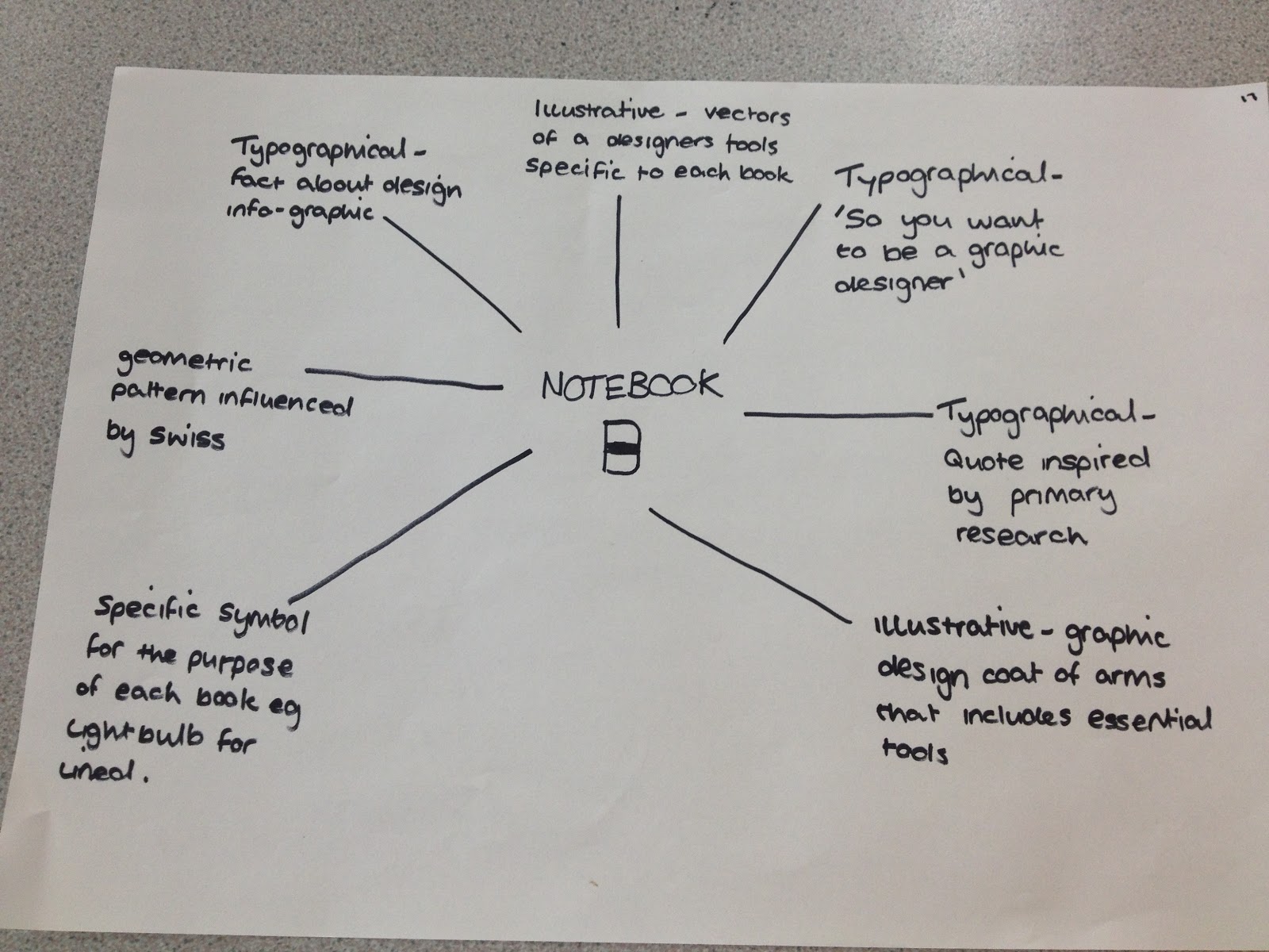
I also created a quick spider diagram to focus on direction for designs for the covers of the notebooks before I set about doing design sheets, I came up with multiple ideas for front cover designs based on visually representing the course through typography and simple illustrations. I came up with the idea of creating a cover that just illustrates the designers essentials to relate it more to the course as opposed to just general stationary. Another idea is to create a coat of arms or crest for the LCA BAGD course, this will consist of both type and image. I had the idea of filling a cover page with quotes collected by this years first year students to give the future students an idea about honest views on the course. Finally I also came up with just create a simple symbol that represents each specific notebook, for example a logo based around ideas and thumbnails, one based on grid, layout and type, and the final cover would be based on the taking of notes.


OUGD406 DESIGN PRACTICE- Communication is a virus evaluation


1. As a group what problem did you identify and why in response to 'drink tea'?

We didn't really identified a problem as such, we just wanted to give people more of a reason to drink tea rather than, it tastes nice or the health benefits or because it's british. We wanted people to drink tea for a good cause, therefore we decided to tie in the concept of charity, and proposed a tea stall to raise money for Comic Relief. We chose the name 'Charitea' for the concept, playing on the words 'charity' and 'tea'. The people we targeted already drank tea because we didn't go out of our way to promote the benefits or why you should drink tea, we just wanted people to drink tea for a good cause.

2. What methods did you use to gather evidence to prove this was a problem and what forms did it take?

Primary:  Beth and Danielle were in charge of sourcing tea and the required items needed, this meant going to tea shops to enquire about pricing, as well other stores to purchase the equipment needed. Laura had emailed Comic Relief and they sent us fundraising packs for the day, including balloons, stickers and a form to fill in for our donation. Laura and I carried out a risk assessment with colleges building reg team, this entailed us researching power points, water points and the risks involved.

Secondary:  We used online supermarket stores to find relevant tea flavours we may of not seen in store, and to help compare prices. I researched infographs related to coffee and tea to find influences, whilst everyone else researched their own personal jobs as well on the internet.

Quantitative: We researched into the costs of the products we were sourcing, as well as competitors costs with the cafe, so we could sell our products for a reasonable cost, raising money, without spending too much initially, or putting people off buying tea from 'Charitea'.

Qualitative: Websites were used for qualitative research, along with on going feedback from our tutors and other students, as well as constantly critiquing each others work for the brief, ensuring we worked together and resolved the problem at hand.

3. What methods of research did you find useful and why?

The primary research on costs proved most vital because all proceeds went to charity the less we spent the better because we didn't want to spend £40 on printing and equipment and only raise £40 because that would have been a massive failure. So by finding out where was best to source cups, tea etc.. was the key component to the success of raising the money we did whilst spending so little.

4. What research could you of carried out that would have proved more useful?

I think focus groups on flavoured tea could have proved more useful because some of the flavoured teas sales figures were terrible and could have easily been improved if we simply asked people what their favourite flavoured tea were instead of trying to find a flavour to suit that specific celeb.

5. How did you manage the workload as part of a group?

I found it difficult to rely on a couple of group members at times especially through the important times like preparing all the cups and belly bands for the stall or going for a drink of water and coming back an hour and half later that really frustrated me because I felt like a couple of us put in the serious hard graft doing all the tedious boring jobs because people didn't turn up.  This time round I found it a lot more difficult to work in a group compared to previous tasks, I don't know why this is. I found it great to work with laura because we have similar mentalities where we don't want to let the rest of the group down even if they're not in so I found Laura and I worked together perfectly towards the end, I feel we powered through the boring nitty gritty jobs like health and safety and asking for permission.  It was difficult to rely on peoples time management as well when they're supposed to be bringing in something we needed to progress but turn up 3 hours later meaning we have to sit around and try and think of other jobs to do as opposed to getting on with the important jobs at hand. At the tea stall I felt like everyone did work as a team and I was just happy to see the end of it to be honest even though I did enjoy the design side of things, the stress and frustration was too much.


Copyright 2010. All rights reserved.

RSS Feed. This blog is proudly powered by Blogger and uses Modern Clix, a theme by Rodrigo Galindez. Modern Clix blogger template by Introblogger.