Archives

OUGD403 Alphabet soup: typeface 1

Development

From the Kid Acne research and taking inspiration I experimented with the hair like pattern. Firstly i played around manipulating the strokes into different shapes and seeing if the shape was still distinctive and recognisable even when surrounded by other shapes using the same pattern, weight and widths. I used a 0.5pt fine liner initially moving onto a sharpie marker to see what the differences were between the 2. I disovered that the marker pen created more of a dark shadowed effect where as the fine liner was a more delicate, precise and intricate pattern.


From this I the set about applying the pattern to a typeface, I didn't choose any particular font I just created a simple sans-serif font that I could easily apply the pattern to without too much difficulty because of the simple shapes. When it's applied to type it reminds me of leaves and plant structures, it also adds texture and depth to a 2-Dimensional flat object. I also think i has a rather furry look to it, similar to plaited hair or something similar.


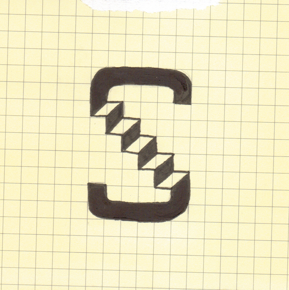
The 'O' below i feel has worked out better than the 'I' because it looks like the strokes are wrapping around and smothering the letter, probably because the 'O' is an infinite loop and never has a start or a beginning therefore it is easier to make the pattern flow smoothly. However I did have some difficulty squeezing in strokes but making it feel like they belonged there and have not been added just to fill gaps.


Below is a the basis for my final typeface. Whilst not being based on an existing typeface like mentioned in the brief it is heavily influenced and based on typefaces Wes Wilson used in his work. It is heavy weighted and very round/bubbly, it also has a free flowing psychedelic aesthetic like the majority of Wes Wilson's work.


I then took the typeface I initially designed and developed it further applying the pattern but also playing around with paisley. I experimented with creating letterforms out of paisley but also apply the pattern to the paisley shape and then forming the letters out of the patterned paisley.


The paisley above is an experiment that didn't work very well. From the group crit on friday we discussed that the paisley looked similar to the shrimp sweets you get from the corner shop. Personally i don't like it because it seems untidy and a bit too much stuff happening at once, it can become quite confusing.


Above is development towards my final letter it features all the successful parts of my development; Wes Wilson style font and patterned paisley forming the letter. I find the different curves of strokes and space between strokes a real key feature and success. It mixes up and separates each paisley shape but also gives a layering 3-D effect to it. The strokes add texture and makes me want to reach and stroke it because when drawn on the thin paper it leaves indented marks which again adds to the aesthetics. 


OUGD403 Alphabet soup: typeface 1

On Monday we were set the task to design a typeface for a full alphabet and glyphs that represents the personality/character of my partner. I were partnered up with Oli Dye and to get to know each other better, we both filled out questionnaires that break the ice and give us both a brief understanding of personal interests and tastes.

My findings were as follows; 

  • He is from Sheffield
  • Favourite colour is red.
  • Earliest memory wearing a green jumper at his 3rd birthday.
  • Admires Kid Acne the most because of his stand out, thought provoking northern sayings.
  • His Kid Acne print is his most treasured possession.
  • He doesn't want a super power.
  • He wish he had created the 'peace' logo.      
  • Sean Bean would play him in a film of his life.
  • He would love to have Stephen fry and David Mitchell at his dream dinner party.
  • He uses the word 'Reyt' the most.

I found some of these questions didn't really give me much to start from therefore i asked some more personal questions that would let me understand him more;


  • He is a northern working class lad.
  • He loves music, plays guitar in an indie band.
  • He loves arctic monkeys.
  • He's into mod culture, paisley.
  • His taste in graphic design is clean, intricate and over detailed.
Firstly I intend to research into, Sheffield, mod culture (type and patterns) and Kid Acne. These will then give me starting point to develop my thoughts into ideas and eventually develop my research into a final typeface. 

Alphabet soup: visual thinking OUGD403

Final Expand Letters

Below are my series of letters I created in response to the word 'Expand'. They're all based on pretty simple ideas and concepts for example the 'I' below is based on the idea that the upper serif has expanded and the bottom one has stayed the same. It all stems from my research into the word expand and the synonyms of the word expand. Other letters are based on the the whole letter itself expanded or letters opening up and expanding using a concertina like effect like the D. 

The D and A are my most successful letters i think, they look 3-dimensional and are the most aesthetically pleasing out of the 10. Even though we had to use only monochrome I managed to achieve the effect of the letter being unfolded like a concertina using black and grey, I also believe that they relate to the word expand the most because it is so apparent and it's easy to understand what they mean without knowing what the word is.


Alphabet soup: visual thinking OUGD403

Expand

I created a spider diagram because it's the easiest way for me to get my thoughts down and analyse what paths to go down and follow. Below is a scan of my quick diagram of ideas and thoughts of the word 'Expand'


From this it enables me to start research in more depth and going down certain pathways that I can ultimately relate to my final 10 examples. I have some ideas brewing in my head already and I feel that if I put them down on paper now I could develop them as I go along through inspiration from my research.


The above ideas are just things that popped into my head when i first read the word 'Expand' I feel that if developed further they could form the base of my final letters.


Alphabet soup: visual thinking OUGD403

"Produce a set, series or sequence of ten letterforms that explore and communicate your interpretation of the word that you have selected from the randomiser"

The word I received was 'Expand' I set about researching definitions and synonyms to give me more of an idea of which direction to go in.

Expand;

  • To increase in extent, size, volume, scope etc...
  • To spread or stretch, unfold.
  • To express in fuller form or greater detail to develop.
Synonyms;
  • Amplify
  • Bolster
  • Bulk up
  • Develop
  • Enlarge 
  • Grow 
  • Heighten
  • Inflate
  • Magnify
  • Spread
  • Stretch
  • Unfold
  • Unravel
I have highlighted the key words in the definition and the key synonyms i wish to research further thus giving me a greater understanding of 'Expand' 

Develop; 
  • To elaborate or expand.
  • To bring to a more advanced or effective state.
Amplify;
  • To make larger or more powerful, increase.
  • To exaggerate.
Magnify;
  • To increase the apparent size of.
  • To cause, to seem greater or more important, exaggerate, attribute too much importance to.
Unfold/Unravel;
  • To reveal or display.
  • To spread out.
  • To seperate or disentangle the threads.
  • To free from complication or difficulty, make plain or clear.
  • To take apart.


Copyright 2010. All rights reserved.

RSS Feed. This blog is proudly powered by Blogger and uses Modern Clix, a theme by Rodrigo Galindez. Modern Clix blogger template by Introblogger.