Final Expand Letters
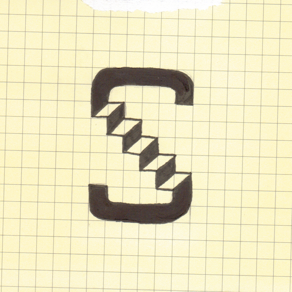
Below are my series of letters I created in response to the word 'Expand'. They're all based on pretty simple ideas and concepts for example the 'I' below is based on the idea that the upper serif has expanded and the bottom one has stayed the same. It all stems from my research into the word expand and the synonyms of the word expand. Other letters are based on the the whole letter itself expanded or letters opening up and expanding using a concertina like effect like the D.
The D and A are my most successful letters i think, they look 3-dimensional and are the most aesthetically pleasing out of the 10. Even though we had to use only monochrome I managed to achieve the effect of the letter being unfolded like a concertina using black and grey, I also believe that they relate to the word expand the most because it is so apparent and it's easy to understand what they mean without knowing what the word is.