Archives

OUGD504- end of module evaluation


BA (Hons.) GRAPHIC DESIGN
LEVEL
05
 Module Code 
OUGD504               


 Module Title
Design Production


END OF MODULE SELF-EVALUATION

NAME
Harrison Park


1.  What skills have you developed through this module and how effectively do you think you have applied them?

Through this module I have learnt and developed a range of new skills that I probably wouldn’t have shown interest in or had the opportunity to do without doing the projects. The whole process of coding was completely new to me and at first struggled to get my head around it, but after the second web session it seemed to click and it all just seemed like common sense, like you are commanding positions, colour, text through a simple, structured code. I think the understanding and development of web design can be seen through my website, even though it’s only simple in both concept and structure all the knowledge learnt in the sessions has been applied precisely. In return I feel my website is easier to navigate though and to understand.


2. What approaches to/methods of design production have you developed and how have they informed your design development process?

By developing a further understanding of print and the whole process of printing professionally it has enhanced my designing methods making them smarter such as the way I lay files out or set them up to begin with. It’s key to understand what the printer wants from as much as what you want from him. These methods have helped during the whole printing process of the projects, I found when printing in the dungeon it went swimmingly with no hiccups, whereas last year there always seemed to be something wrong with my file or James would have to intervene and layout my designs correctly for them to print properly. During the design process I was always thinking ahead and asking myself questions like ‘Will it print?’ ‘What will it look like?’ I would have never have done this previously which always hindered me towards the end of projects.


3. What strengths can you identify in your work and how have/will you capitalise on these?

I feel like my layout skills develop throughout every project and because I pay meticulous detail to the position of every stroke and text box it all ends looking uniform and crisp. Even though as soon as I print it double sided they’re generally around 5mm off because of the automatic feed which then makes all that time spent feel like a waste because it’s not portrayed in the finished piece.


4. What weaknesses can you identify in your work and how will you address these in the future?

I feel like the development stages of my work are always lacking because once I eventually decide on a concept I either have little time left because I couldn’t make a decision quick enough, or I just get an idea and go with it which hinders how far it can be pushed because I’m not exploring the vast corners of an idea instead I have blinkers on and don’t look what’s around and where it could go. By simply spending a little more time exploring and pushing these ideas further it will in turn make the designs much stronger and could make my life easier because I won’t be doubting where it could have gone because I’ve explored and seen where it could go.


5. Identify five things that you will do differently next time and what do you expect to gain from doing these?

1.The biggest thing I would do differently next time would be to just keep on top of the workload, I found it really overwhelming and at sometimes suffocating. Keeping on top of this would allow me to have more freedom to address different concepts as opposed to selecting one because it needs to be done soon.
2. ‘Measure twice, cut once’ This is something I need practice more next time. I spend hours designing and laying up designs and they’re often not aligned when printing double sided or I often make mistakes when trimming, this again is also down to my lack of time management and leaving myself enough time to do the important finishing touches that actually count as much as the design.
3. I found during this module I was always sitting on the fence and too scared to commit to a concept or a brief, this resulted in me time wasting whilst I decided. Although it is good to mull over concepts it is also key to commit and see where it can go and what can be done. Committing will give me more time, more time to rectify mistakes, design, produce and just more time on a project as a whole.
4. I think my approach to a brief should be different next time round, at the start of briefs I’m generally a lot more relaxed and laid back whereas if from the word go I was on the ball the workload and level of my work would in turn increase significantly.
5. Organisation is key to being on top of projects I feel, be it the simple things like keeping my drawer tidy and in order, to design files being put into folders instead of having an overflowing desktop and workspace. It can quickly snowball due to the intensity of the project and I often find myself struggling to find files. This simple task will allow to work more efficiently with a lot less stress.


6.How would you grade yourself on the following areas:
(please indicate using an ‘x’) 

5= excellent, 4 = very good, 3 = good, 2 = average, 1 = poor

1
2
3
4
5
Attendance


x
Punctuality


x
Motivation


x

Commitment


x

Quantity of work produced


x


Quality of work produced


x

Contribution to the group


x

The evaluation of your work is an important part of the assessment criteria and represents a percentage of the overall grade. It is essential that you give yourself enough time to complete your written evaluation fully and with appropriate depth and level of self-reflection. If you have any questions relating to the self evaluation process speak to a member of staff as soon as possible.

Design for print and web- final design boards

Print and Web Design Boards

Design for print and web- Evaluation

Going into the print and web brief I had high expectations of myself and felt that the brief I had chosen allowed me produce a vast amount of branding and design, although I produced a number of things for the project I feel like it was lacking in areas down to my lack of judgement and and time management towards the end of the brief. In the future I need to be more organised and prepare for things to go wrong as well judging that I need more time to purchase things externally such as stamp handles and stock.

The red of the whole project turned out differently to what I expected, I ideally wanted a more brighter vivid red whereas the colour printed is a much deeper red that in the end I did like and it was all uniform but I would have preferred a brighter colour.

The website I feel ties in with the whole design of my project and it's clear the 2 are linked together although the website is the red I wanted my printed material to be which looks odd when placed side by side I think. 

I also need to allow for time to photograph my work much better, even though the images now show everything there is to show about my work isn't doesn't necessarily do it justice. Better lighting and laying out of the materials would the designs of a lot better giving them a more professional feel.

I don't feel like I have let myself down with the outcomes of this brief, I just know I can do a whole lot better and it's deflating knowing that it's true.

Design for print and web- final proposed website

Below are the finished website pages with all the text and images placed into the template I previously created. The information is partly what is in the printed material but also new things that a different and exclusive to the website such as a blog and the access to purchase tickets.

Home
This page is an introduction to the festival as well as showing what is on and when.

Blog
I wanted the blog to be right aligned as to differentiate it from the rest of the website. I see blogs as an extension of the website but also something different to the website.

Tickets
The tickets page consists of a simple form that is filled in with the correct personal details and the choice of event, you will then go to checkout which directs you to paypal where all money transactions will take place.

Find us
This is a simple page that clearly states the address of the event and parking availability.

Website mock ups

Home/About page
Blog page
Find us page
Tickets page


Design for print and web- web development

I felt like the website should be pretty basic for a pop festival of this nature, I didn't want to show too many images of the event and what's on because then people won't find the need to come visit because they can just view it all online. There are 4 main pages of the website; What's on/About, Blog, Tickets and Address. All of these 4 pages address everything you need from when you visit an exhibitions page, you want to know what's on and when? where is it? how do I purchase a ticket? and you want to be kept up to date with all the latest announcements through the blog.

After the first event there will then be a fifth page added which will be about past events. It'll simply be photos of the atmosphere and people enjoying themselves to further showcase the pop up festival and attract future visitors.

Because the web design I'm doing the website after I have already designed the programme I feel like the design should be consistent and what I have already designed should be reflected in the website. The programme uses boxes and lines to frame text and pictures, breaking up the vast white space therefore it is continued throughout the website. 

Below is the screenshots of the natural progression the development of the website.


The box around the whole screen seems kind of restricting and suffocating, I don't think it works well on a website. There I'm going to experiment using the box with other things like text. The positioning of the heart seems slightly strange as well. At the moment it looks nothing like a website and more a presentation board.


Even the boxes around the text don't work, I don't think they're necessary and I'll think the idea should be scrapped. 


After more playing around with layouts and different way to visually represent buttons for other pages, I feel like it's now progressing in the right direction. I feel it just needs the logo moving and title to finish of the basic template ready to insert text.


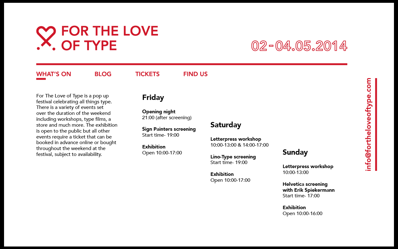
The final website template and layout is shown above. I've slightly altered the lined and moved it further down giving it more vertical spacing and I've also changed the date to an outline to make it different to the website title and logo, it's visible and noticeable but doesn't detract away from the main titles. I inserted placeholder text and an image to show it could look once everything has been inserted.


Design for print and web- final printed material

Below are images of the all the printed material that was created for the festival, it consists of a range of range of requirements that were specified in the brief. All of the design is in keeping with each other and it all works together as a set. I had some issues with colour that was printed, it wasn't as bright as I had initially wanted it to but because everything was printed at the same place using the exact same printer, it didn't make it that big of an issue. If separate things had been printed in different places it could have caused an issue because the colours wouldn't match and it just wouldn't work as an identity.

The colour could be down to the stock selection as well, because it is an uncoated stock colour appears more saturated as the inks are absorbed by the paper as opposed to sitting on top of the paper like with coated stocks. 

Of course the images need photographing more professionally, with a much better camera and lighting because the images now don't do the design justice.

Tickets + Envelopes
Front and back 

 Perforated tear off 

Ticket embossing for authentication

Embossed ticket

Envelope and ticket

Envelopes


Postcards
Postcard 1

Postcard 2


Postcard 1+2

Event porgram


Opposite side of program


Event posters


Poster tubes

Bradning set


Copyright 2010. All rights reserved.

RSS Feed. This blog is proudly powered by Blogger and uses Modern Clix, a theme by Rodrigo Galindez. Modern Clix blogger template by Introblogger.