As an example the whole class discussed the NASA logo

This logo was used by NASA during the 1980's shuttle missions, it was either black or red. The red signifies the danger of the job they're doing but also serves as a symbol of patriotism. The curved and futuristic font resembles the tubes used on the shuttle, the components used to keep them alive. We discussed why the A and the S were attached, we thought it could be something to do with the A representing the word astronaut and the S represent shuttle or space, so it's the connection between the astronaut and the shuttle and space.
Using the discussion of the NASA logo as a basis we set about discussing the examples we had collected, in groups.
Ellen
Apple- Simple logo based on geometric shapes, kind of undated even though it's been around for a very long time and hasn't changed much. The san serif font used affects their tone of voice it has a professional feel but seems less corporate and more inviting/friendly

Liz Earle- simple flower in a circle, nature. By using a light grey neutral colour against the teal background it gives off an image of refreshment, youth, vitality and revitalisation.


OGIO- using the natural colour of the product to add to the logo through the large 'O' in the label, the function with the logo makes it more memorable as opposed to a normal bottle of wine. The simplicity of the logo along with the packaging appeals to a younger market but doesn't solely restrict it. The simple sans serif font used on the red wine conveys maturity, class and richness. Whereas the serif font used for the rosé conveys more elegance and femininity.

Bagel nash- Rounded typeface possibly to represent the bagel, friendly sans serif typeface that aims towards a more modern trendy professional. The bagel is clearly represented in the middle of the text but unsure as to what the lines mean, we had a discussion and some said it could refer to infinity, how the bagel is an infinite loop, a full hoop, never ending.
Laura
All saints- variety of logos ranging from fancy elegant script lettering to a stamped rams head that has an industrial feel to it. We believed the industrial style relates back to where it was founded in Spitalfields
Joe Malone- simple type set in a black border, gives it a much classier, expensive feel to it. By adding London underneath the name it gives a sense of expensive/ a higher stature.

Elemis- the simple wavey line in the the E gives off a sense of pure, natural, clarity... as if it's healthy and revitalising.
Chloé- so simple and classy, scream class and French. Unsure as to why they've used that specific font but maybe it's just to keep it original to what was first used...
Priyesh

Puma- a puma is active day and night, they used the puma jumping over the brand name to give that active, athletic motion. A few people talked about the logo being very dated but I believe if it was to be rebranded dramatically to make it more modern it wouldn't be successful.
Twinings- very traditional with it's use of ornate serif font, screams class, heritage and tradition, accompanied with the crest and the words 'London' gives a sense of patriotism and again class.
VAIO- the V and the A are the symbol for analog, and the I and O are digital symbols which represents the companies technological background and history.
Braun- designed on a 1-1 ratio which means it'll theoretically work on any scale, we discussed as to why the A was larger than the rest of the letters but struggled. This could be something to be researched at a later date

Kandoo- the use of green and purple makes it less gender specific which is key to appealing to a wider children audience. The design of the K looks like a frogs foot spread which ties in with the frog mascot but also the use of green.
Joe
Harvard African and African American- The diagonal line intercepting the H turns it into a monogram and the use of gold for the diagonal line helps distinguish the A from the H.
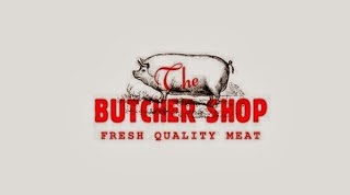
Butcher shop- the use of red block type relates back to tradition and history. The red either represents blood or the stamps used on the animal carcasses to date them. It has a very traditional aesthetic with the line drawn pig in the background with the large contrasting red block letters on top. From looking at the logo you get the feeling the company is a traditional, farmhouse, family run kind of business. It doesn't scream corporate.
NBC- talked about why they've used the peacock and the 6 different colours. Originally the mother company produced colour TV's and NBC was one of the first channel operaters to broadcast in colour so they went with the multicoloured peacock. As for the 6 coloured sections, each one represents an area within NBC, such as green for the sports division etc...

Belle Ninon- very similar to Joe Malone's logo, simple, classy, elegant. Visually represents the brand that sells high end fashion.
National Geographic- Yellow border around magazine has become the logo based on the golden ratio. Strong simple logo and easily recognisable with only the yellow box. The yellow box could resemble a photo frame, capture the moment.
Sarah

Knife- Again know nothing about the company but from the logo and the name it tells us it's something to do with knives. Creative use of negative space and the knife blade.

UP- Management consultancy firm, going in the right direction and is appropriate name for the company, but doesn't portray a management consultancy firm, almost looks like graffiti like with the single flowing line and arrow head.

Wave- this logo is definitely form over function, it's pretty naff, even though it is quite onomatopoeic the colour selection tells us nothing about what it is, one can only assume it's something to do with water sports.

Horror films- simple yet effective logo, basically 2 in 1 imagery, it's a movie reel representing the film part of the company and the reel holes resemble a scream face to represent the horror section.