For the colour experiments I intend to initially experiment with Lego bricks against objects around the house, exploring a different contrast for each experiment.
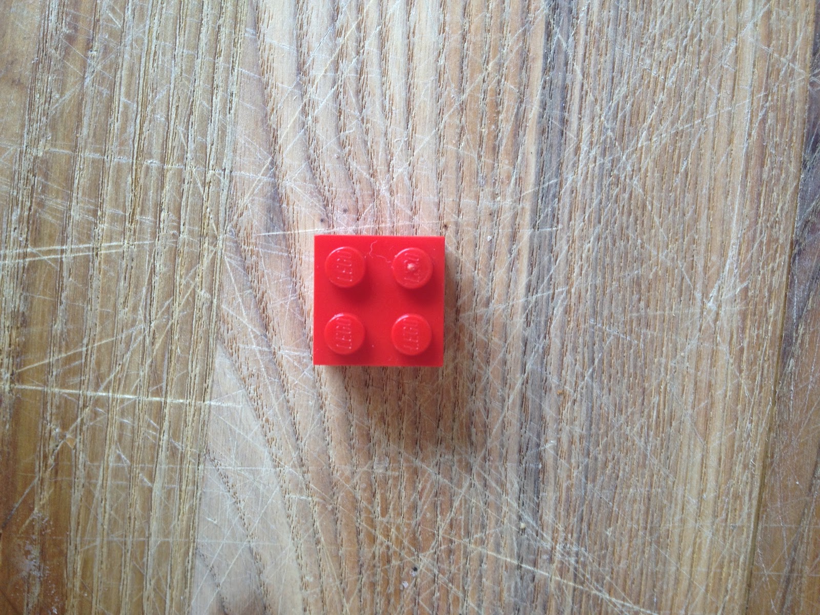
Experiment 1- Brick on wood, the contrast of temperature.

This wood has mainly cold blue, grey tones because of its lightness of the wood but some of the grains that break up the coldness are a more warm orange brown. There is a high temperature contrast because these warm tones aren't significant enough in size to affect the overall coolness of the wood against the much warmer red brick, even though the red is drifting more towards a cooler blue and away from the warmer reds and oranges.

The temperature contrast between this wood and the brick is significantly smaller than the last image because of the warm orange brown tones of the wood against the slightly colder red tones, but there isn't too much of a contrast because the two of them.

There is quite a cold contrast between the two objects in the image above even though there are warm tones in the grains running throughout the wood but again the majority of the area is filled up with cold blue/ grey tones. The brick itself is a much colder red than usual because of the lighting of the image, the cold tones are mainly around the centre of the brick.
The brick in this images is a lot warmer than previous images and this is more of a true red, meaning it is a drifting more towards the warmest orange tones. It is a little bit harder to distinguish a contrast between the brick and the background wood because it is multi tonal. It has warmer brown streaks running vertically through it, as well as a much colder, lighter grain. However there is slightly more warmth running through the wood but there is still quite a larger contrast of temperature because the wood is still quite a cold tone compared to the more warm true red.
Experiment 2- Brick on brick, contrast of Hue


The brick with the highest contrast of hue is the red and blue brick because they are the furthest away on the colour wheel from green. If this was about tone then the white or black would have the highest contrast because on the tonal wheel blue is black on the tonal wheel meaning they're both equally spaced from the green. The yellow and saturated blue brick are closer to the green on the colour wheel meaning there is less of a contrast of hue.
Experiment 3- Contrast of extension


The image above has a low contrast of extension because the two colours are well balanced and proportioned where as the image right at the top and the image below have the highest contrast of extension because they're both extreme unbalanced colours.

Experiment 4- Contrast of extension part 2


The image above has the lowest contrast of extension because the two colours are evenly and work more in harmony than the other three. The reason the green bars have to be wider than the red is because the green is a more saturated than the red which is near its truest colour. Therefore the wider green strips balance the thinner harsher red.


This image has the highest contrast of extensions because it is extremely unbalanced due to the red completely over powering the the thin saturated green lines.
Experiment 5- Contrast of complimentary


The background has hints of oranges and browns in it as well as greys meaning the brick with the highest complimentary contrast is the blue brick because the background is closest to orange and the complimentary colour to orange in blue. The brick with the least contrast is between the yellow and red brick. The red and yellow brick both have slight hints of blue moving it away from their true colours but still puts them close to orange on the colour wheel.
Experiment 6- Contrast of temperature part 2


The background is extremely cold because of its strong hints of heavily saturated blue, meaning that the saturated blue brick provides the lowest contrast of temperature because they're both extremely cold and similar tones. The red brick has the highest contrast because it is the warmest coloured brick out of the selection meaning it is the furthest away in temperature from the blue background.
Experiment 7- Contrast of tone


The black and the true blue brick have the highest contrast of tone because they're both the furthest away from the highly saturated grey background on the colour wheel. The green and yellow brick have the lowest contrast of tone because they're both nearest to the grey on the tonal wheel. The white brick has quite a high contrast because it is relatively far away from the grey but just not as far away from the black because the grey background does have slight tones of white in it.
Experiment 8- Contrast of complimentary part 2


The Green brick has the highest contrast of compliment because it is the complimentary colour to red. The red brick has the least contrast because they're similar colours meaning theres near enough no complimentary contrast at all. The blue and yellow bricks are equally positioned away from red on the colour wheel meaning their contrast is similar, these colour have moderate contrast but not as much as the green.
Experiment 9- Contrast of saturation part 2

This has the lowest contrast of saturation because there isn't much difference between the true red square and the background


The image above has the highest contrast of saturation because the square in the middle is the truest red whereas the background red is the dullest red out of the selection. This means there is a big difference in saturation between the two colours.


This also has quite a low contrast in saturation, even though the two squares are heavily saturated there isn't much difference in saturation between the two. The difference in saturation is the key thing.
Experiment 10- Contrast of saturation part 3


This image above has the least contrast of saturation because it is extremely dulled down whereas the pink and turquoise have the highest contrast because they're bright and vivd meaning there is less grey tones in these colours compared to the background colour. The red image has a substantial contrast but it just isn't bright enough compared the the other two.