Archives

OUGD406 DESIGN PRACTICE- The Tea Stall and Presentation

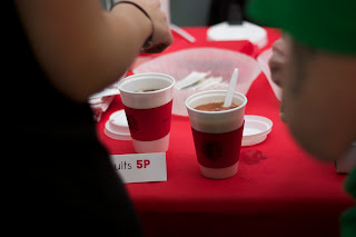
These are the images from the event we held outside the graphic design studios, we worked in shifts to sell the tea. The stall was open between 11 and 2, once 2 o'clock came we tallied up all the sales and started work on the app and the results poster. Instead of just packing and because we were raising money for charity Laura and I decided to work from the stall so that we could raise some more money. The tea stall was a huge success, raising around £64 for red nose day but we also got the majority of graphic design to drink tea which was a success in terms of replying to the title of our brief.


Below are the 3 boards we used for our presentation describing the concept, content and how we delivered it-


OUGD406 DESIGN PRACTICE- Letterpress workshop

Today I attended a letterpress workshop down at vernon street, we were asked to think of a quote that we could then print. My quote was 'You're not a failure if you don't succeed, you're a failure if you don't try'

First of all we learnt the basic terminology for letterpress such as leading, a chase, quoins, furniture and composing stick.

  • Composing stick- This where we manually set the type.
  • Chase- is the metal frame in which the type is packed.
  • Leading- is a thin sheet of lead that is placed between each line of text, more can be added depending on spacing. Leading can also be used to pack the text in a chase.
  • Furniture- are wooden or metal blocks used to pack the text inside the chase as well packing the chase in the letterpress machines.
  • Quoins- are two blocks that expand with the turn of a key that firmly secures the text along with the furniture into the chase.
First of all we decided on fonts in pairs, we chose to use univers pt 24. It is all organised into a drawer that follows a map similar to the one below.


This is what the drawer looked like


Type is laid out upside down with the notch facing upwards, but still from left to right. I used a 20 leading which is the width, I used 20 because that quote wasn't too long and would fit on around four lines. But if I was to use a longer quote there are larger leadings available so tat all the text fits on less lines.


This is the completed quote all laid out and ready to be packed into the chase using furniture and quoins. At the end of each line you pack all the text in with quads, mediums and thins. Those are just terms used to describe the size of the lead used to pack in all the text.


Above are 3 key items used in letterpress; a composing stick (where the text is manually set), furniture (block of wood used for packing) and leading (thin sheets of lead)

One of the technicians then helped pack the text into the chase by using furniture and coins, images of the process are below. It was a very lengthy process trying to find the correct size so it would fit in the chase so that the quoins could expand and fit;


We then used larger metal furniture and quoins to secure the chase into the letterpress machine and ready for printing. The letterpress machine works by inked rollers applying a thing layer of ink to the set type and behind is another roller that rolls the paper along the inked set type. The paper is held in place by mushroom clips that are foot operated.


These are the finished prints, they will take up to day to dry therefore they were left down at Vernon street, once I receive them I will photograph them and analyse the quality etc...


I thoroughly enjoyed the whole process of letterpress, I love learning such a traditional technique that seems to becoming more and more popular nowadays. I found the whole typesetting rather therapeutic and I would love to use this method on a future project depending on the time boundaries. I liked the whole hands on approach and I felt like I had a achieved more than just typing it out in Illustrator or any other software.

OUGD406 DESIGN PRACTICE- results poster

Because I couldn't actually create the app Laura and I came up with the idea to create a poster to be placed around college to express gratitude but also to show the results of the winner (which tea was most popular). I then created the poster below using a pre existing info graph I created for the proposed app, but applying patterns inside each segment that can then be related to a celebrity. The poster is to be printed on to the same red stock the belly bands were printed on to to make sure everything is uniform but to also save on printing again because it means we can add colour whilst still still printing black and white.

I have noticed one slight issue with the final poster, whilst showing how many cups of tea were sold I haven't actually shown how much money was raised. This is something that I think needs to be rectified so that people know, but also so that we can fully express our gratitude.


OUGD406 DESIGN PRACTICE- The final app


Originally to create the app I was going to use Shoutem.com which is an app building website that enables one to build an app based a pre existing structure. For example a blog will have an app structure already built and all you have to do is apply images. However there wasn't any existing structures that were suited to the kind of app I proposed. The kind of app i wanted to make was a simple main page that had 6 links leading onto celebs pages. However each template had different layouts, structures and page amounts. Therefore I will now just propose my app as an idea to spread the results of out tea sale and if it has worked.

Laura suggested that as well as proposing the app to show our results we also create a simple info graph poster that can be printed and placed around college to show the overall winner and the money raised. But also to say thanks to everyone who buys tea from us. After discussing with her we have decided it must be simple because I will have to create it after the tea sale on thursday.

Below is the final app proposition that has been developed from the initial sketches I produced last week. I experimented with many info graphs and there was a lot of going back and forth because everybody needed to agree that it was easy to understand but that it also fit in the with the style of everything else the group is making.

Start up page

Main page

Celeb results

Celeb results

Celeb results

Celeb results

Celeb results

Overall comparative results

Then below is the board displaying all the app pages that will be shown in the final presentation tomorrow. I'm really happy with the way the app turned out, it's in the style of all the other material created by the other members in the group. One thing missing from the app is a total amount of money raised for comic relief. It's just a shame that I couldn't actually produce the app but the poster will basically do the job the app was proposed to do. The poster is actually better thinking about it because it will reach a larger audience if we place it around college because not everyone has access to apps and I doubt anyone would have downloaded it anyway. 


OUGD406 DESIGN PRACTICE- Mug infographics

To illustrate how many cups of tea are sold I am creating an info graph application that illustrates how many cups of tea were sold that that certain celebrity. I aim to create tea themed info graphs influenced by the info graphs on tea and coffee I initially researched. 

Below are digital samples of various methods of visually representing tea related information and data. A reason for experimenting with several cup styles and sizes is because I don't actually know what size of a gap they will need to fill in the app because we have still yet to create the body text that will accompany the info graphs.

The first few below are based on viewing a mug from above, the circular rim of the mug made it easy for me create a comparative pie chart. I then experimented with different colour schemes to present to the group;


The one above was the most popular because it was the simplest way of portraying the information. It was clear to read because of the high contrasting white number against the red segment.


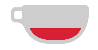
Below is a side view of a mug info graph that is based on a bar chart as opposed to a pie chart. This one is ideal if we decide to use a lot of body text because it doesn't take up too much room height wise. I've stuck with the most successful colour scheme from last time to save on time. The major issue with this is getting the percentages perfect because it's thinner towards the bottom of the cup meaning it works on proportion meaning I'll have to guesstimate on how full the cup is. This is a lot harder to create than a simple bar chart as above.


I also experiment with the idea of visually representing the number of cups sold by stacking the amount of cups on top of each other and simply displaying the number of cups on a belly band. This is great idea and completely different to the other two which are all based on ratios. However there is a major fault with the idea i think, if we do sell a large amount of one flavour, there will an extremely tall stack of cups that probably wont fit on screen unless there is a scroll available. Therefore this is more of a proposition than a final info graph. Even though it is basically unusable I think it is the best visual representation out of them all because it's different but it also looks similar to the cup designs we intend to use meaning it would tie in a lot better than the other images.


And then finally I have created a comparative pie chart that enables the viewer to see all the results on one chart, putting into perspective how many are sold as opposed to another celebs tea. It's pretty straight forward design wise but slightly similar to the other pie charts I designed just because the charts are containing more data so I wanted it to be lot simpler thus meaning it's easier to understand without being distracted by designs etc...


The chart below works the best because the white is a greater tonal and hue contrast against the red background as opposed to the black. This means the lines are a lot clearer and crisper.


Then to illustrate what the info graphs could potentially look like as a final app I quickly mocked a page of the app. It illustrates the size of the info graph in comparison to the screen and how much space is available for text. The final decision is based upon how much text is to be used I think, but it seems to be heading towards the side view mug because it is the smallest of the three but it could prove difficult because of the proportions that I discussed earlier on.


Copyright 2010. All rights reserved.

RSS Feed. This blog is proudly powered by Blogger and uses Modern Clix, a theme by Rodrigo Galindez. Modern Clix blogger template by Introblogger.