Archives

OUGD505 Design Practice- Task 4

Build a Brand

Background

Define your brand
Review the product or service your business offers, consider the emotive and rational needs and concerns of your customers / consumers. Your brand character should promote your business, connect with your customer base and differentiate you in the market. Identifying the core principles of your company can provide the backbone of your brand and what you, as a company, stand by and adhere to.

When building your brand, think of it as a person
Your personality determines how you behave in different situations. Of course for people it's intuitive and it's rare that you even consider what your own character is, but when you're building a brand it's vital to have that understanding.

Consider what is driving your business
What does your business believe in, what is its purpose and who are its inspirations. These things can help establish your emotive brand positioning and inform the identity and character for brand communications.

Your brand should always use a consistent tone of voice
It will help reinforce the business’s character and clarify its offering so customers are aware exactly what to expect from the product or service. Alternatively, aim to make your key messages work together to build a coherent identity. 
Be aware of your competitors and identify the opportunities and threats to your company.
Who is your target audience?
Branding should be targeted to the demographic that your service is aimed at.


Don’t mimic the look of chains or big brands
Try and carve out your own distinctive identity. Independent operators can leverage their status to attract customers who are looking for something more original and authentic, which aligns with their own business.

Be innovative, bold and daring – stand for something you believe in
Big brands are weighed down by layers of bureaucracy, preventing them from being flexible and reacting to the
ever-changing needs of their customers.

Consider your branding when communicating to your customer base.


Workshop Brief

You will be working as a creative trio for this workshop. Your trios will be drawn up at random. You will randomly draw out a company or trade that you will have to brand. Treat this as a start-up business, rather than a rebrand or a re-fresh.

Consider what roles you will be allocating and also consider the time you have on this project.

1. As part of this task, you will have to digitally create a ‘Brand Guideline’ or ‘Brand Style Guide’ to articulate the driving force behind your brand. This will create the structure that you will build from, to and within. Decide what you have to design first in order to build your brand. 

This will include, but not limited to                
Concept – Overarching concept, how does this define and focus the brand?
Logo & application – How to use the logo & how not to.
Typography - Font choices, Point sizes, Hierarchy, Number systems, leading, tracking, kerning.
Colour Selection – Linked to your concept of possible.
Layout & Grid – for differing formats and sizes.
Tone of voice
Copy
Web

2. Create a brand map / plan of application / body of work of the products and services your brand will stretch across (for example & not limited to):

Logo & application
By-lines / straplines
Product, Range and Distribution (methods, application)
Advertising
Audience
Way finding
Invoices and associated stationary
Proposals

You are expected to produce a large digital body of work. If you have managed your time well, you have the option to print out if you feel it is necessary. All of this work you produce will be compiled into a slideshow and you will present it to the group on Wednesday 5th March. You will present as though you are pitching to a client. You will have a maximum of 5minutes per trio to present, so keep it to the point and explain why you have made certain decisions.

We would like to hear your pitch as though you have finished a project for a client, so we will not be focussing in on the developmental aspect to the project. We want to know the concept, what the brand is, who your audience is, why your designs are successful, and brand strategy.


OUGD505 Design Practice 2_ Studio Brief 1 Interim Crit

Today we presented our progress with the 16 page publication based on the research topic of our choice. For the presentation we were asked to bring in everything we had done so far; layouts, mock ups, print outs, packaging nets and mock ups.

Strengths
  • Good structured layouts.
  • Thorough layout, mock ups and considerations.
  • Really strong layout of timeline that's easy to read and interpret. 
  • Layout is clear and understandable. 
  • The concept of using material that relates to materials used in the space race as packaging/sleeve would work really well, also relates to the whole concept of the book.
  • Timeline is clear and engaging approach to presenting and comparing historical elements; this also fits the title 'A journey to the moon'.
Areas for improvement
  • More research to gain content.
  • Develop content into different layouts to show variation.
  • Try experimenting with a less precise structure for your publication as you mentioned in your layout variations; this would be relevant to visually representing the impact of the lack of gravity in space.
  • More packaging ideas and possible formats other than a book and envelope.
  • Look for more creative ways of telling the story.
  • More gradient over a little bit to avoid interference with the blue text.
  • Needs more space themed that won't make it look tacky.
Considerations
  • During research, look at features and characteristics of rockets, uniforms, equipment etc. These will inform choices of aesthetics as well as packaging mechanics.
  • How could you use stocks and print methods to aid you visual presentation telling the story?
  • Maybe look into actual NASA products for inspiration. Most of their products are really dated but might be good for packaging ideas.
  • Look at stocks and materials to link in space things more. Vernon street vacuum pack swell as woodwork room at Blenheim does vacuum plastic.
  • Silver belly band, rocket ship, astronaut suit, helmet, moon shaped boxes.
  • Look into galactic print as an inspiration for colour hues.
  • Look into stock and experiment.
  • Try other colours as eel as the current, other blues and greyscale etc...
  • Sleeve idea for packaging is simple but if foiled as discussed it would reflect subject more.

OUGD505 Design Practice 2_Layout Workshop

In todays session we were set the tasks of creating a flyer and brochure focusing on format and layout. Each of the briefs were quick turn arounds, solely intended to arise the subject of layout and its' importance within design.

Flyer 

Background
This simple layout task will ask you to utilise a short amount of body copy, title, date and location. The minimal amount of text allows for the simple use of single imagery and the type to serve as the main visual elements.

Brief
You are asked to produce a simplistic flyer design for Jackson Rising exhibition at MoMA (Museum of Modern Art- New York) using the instructions below;

Specifications
Format: A5 – Portrait

Title: Jackson Rising

Sub-Title: Curated by Jenny Dowd

Date: August 3, 2014 - August 31, 2014

Copy: Four artists met at an artist residency at the Ucross Foundation in 2013, now they come together to inhabit at MoMA, New York.

Location: MoMA, New York.

Contacts:
info@jacksonrising.com                                                                            
www.jacksonrising.com
www.moma.org

Image: Jackson Rising ident / MoMA logo / NYU logo

Use of two colours only: Black and white


Brochure

Background
This text/image heavy layout will ask you to utilise body copy, title, date and location, heading, sub heading, imagery, indexes, highlighted quotes. The amount of text allows for the use of imagery and the type to serve as the main visual elements.

Brief
You are to layout and design a 10 page concertina folded brochure for a forth-coming exhibition titles 'jackson rising' at MoMA, New York. Al images, copy and branding are included. You have to create a visually stimulating layout that showcases the artists' imagery but does not sacrifice important information in this process. The images and information must flow harmoniously and offer taste of what is to be expected during the exhibition. 

Branding elements must be kept to black and white. Images must be unaltered and in colour.

OUGD505 Design Practice 2_Studio Brief 1

Packaging Mock Ups/Nets

Printed and built mock ups
For a feedback session I printed out my nets and crafted them just to illustrate how they'll work in conjunction with the printed research book. I think the belly band works best because it allows me to package and keep together a z-bound book but also doesn't cover up too much of the covers as it will be be full bleed images. The belly band allows me to add a title and contents to either side of the band so it works no matter what side of the book your are looking from. Even through it doesn't offer protection in the slightest to the publication I feel it serves a different purpose and function that aids more than to protect.


Final Bellyband 
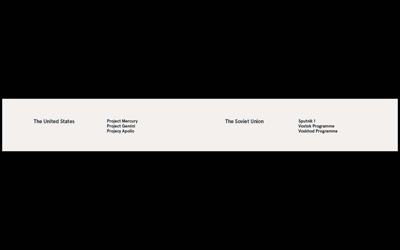
This is the final belly band below, i've kept it super simple as to not detract from the main focus which it the imagery, each side of the band basically gives you the title and the programme involved in each countries race to the Moon. 


Copyright 2010. All rights reserved.

RSS Feed. This blog is proudly powered by Blogger and uses Modern Clix, a theme by Rodrigo Galindez. Modern Clix blogger template by Introblogger.